PROJECT OUTCOMES
Empowered merchants to independently launch retention workflows via a no-code cancel-flow builder, cutting configuration time from 120 to 15 minutes, helping UK brands retain customers and grow subscription revenue.
Increased self-serve adoption of Cancel Flow from ~10% to ~80% by redesigning the end-to-end creation and launch experience, shifting implementations from engineering-dependent to merchant-driven.

My Role
Product Designer. I owned the work end-to-end: research, problem framing, competitive analysis, concept exploration, prototyping, usability testing, and final UI design.
Team
Me (Product Designer), Emanuel Mota (Product Manager), Tiago Bouças & Pedro (Solution architect & Engineers)
Clients / Merchants
Timeline
3 weeks | Design sprint | Jun 2025
PROBLEM
Okay! Let's first understand the problem of Mr. Terry (Retention Manager in coffee subscription brand)…

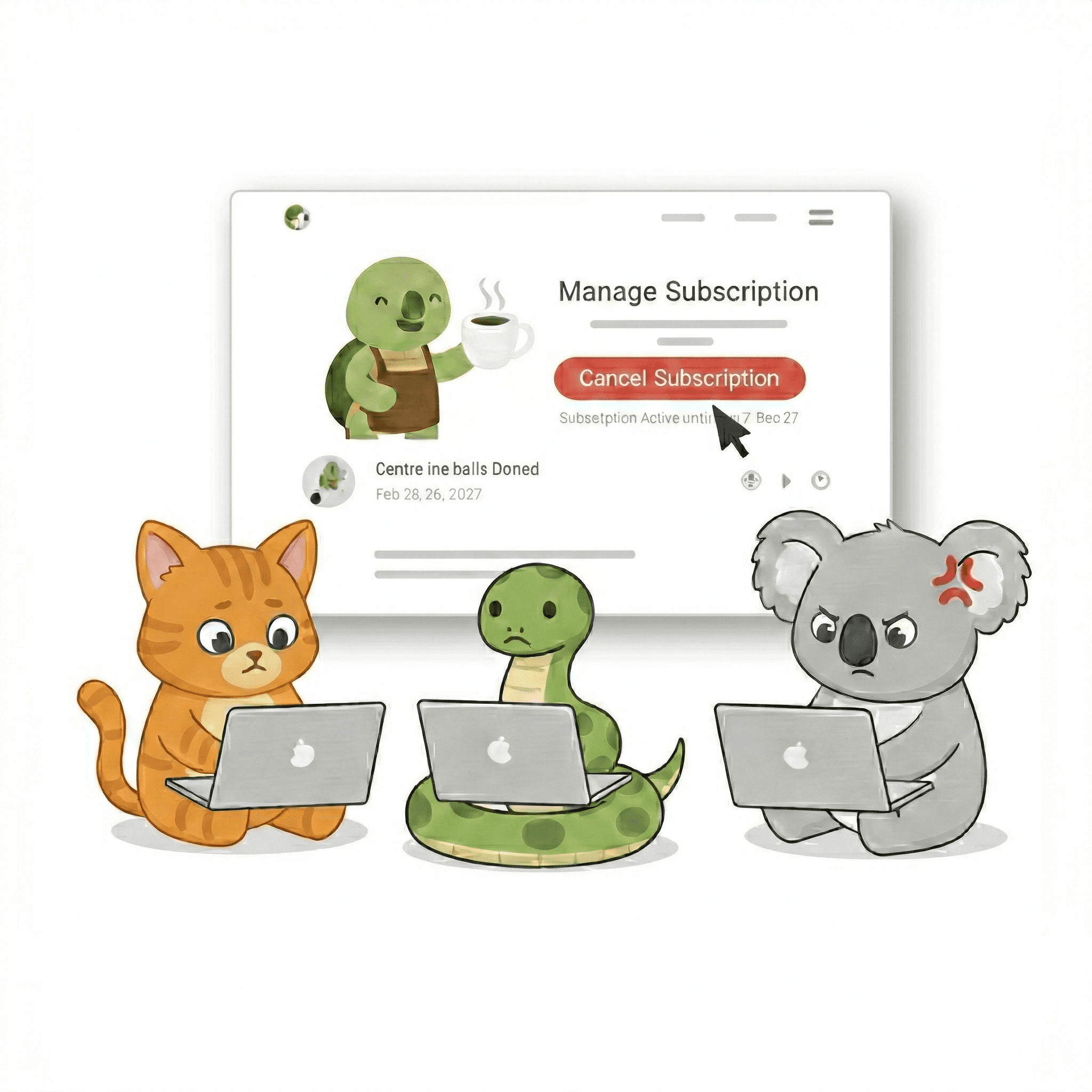




SO THE CHALLENGE WAS
Reduce engineering costs and time by enabling merchants to easily create personalized retention flows based on why subscribers cancel.
PROBLEM SPACE SUMMARY
The Gap Between Potential and Reality
Merchants had the tool but couldn't unlock its value. And roughly 40% of saveable customers were slipping away every month as a result.
The old experience — setting up a cancel flow (admin) and what the subscriber saw on the other side.
Through merchant interviews and an audit of the existing flow, I mapped four gaps that were keeping the feature stuck:
Hidden Complexity Kills Usability
Everything buried in modals and accordions. Merchants couldn't hold the whole flow in their head - errors and logic gaps only surfaced once real customers hit them. (Problem Area 1 & 2 in the above video)
Setup Takes 45–120 Minutes
Too slow to configure. Too slow to iterate. Result: Only 41% of merchants who started actually launched it live.
No way to target specific customer segments
Segmentation logic wasn't self-serve. Any merchant wanting to target a specific customer type had to file an engineering ticket and wait. An 8-month, $500 loyalist got the same offer as a first-timer.
Flat, One-Step Cancel Experiences
Subscribers wanted specific modifications - pause 1 week vs 2 weeks, swap a product, edit quantity. The platform supported them, but merchants weren't configuring them that way.
RESEARCH DETAILS
What problems merchants & customers were facing?
To understand where the friction actually lived, I ran video interviews with merchants (Pact Coffee, Pasta Evangelists, Pinter, Free Soul) and with subscribers who'd recently tried to cancel. Then I synthesised the findings into four working insights:
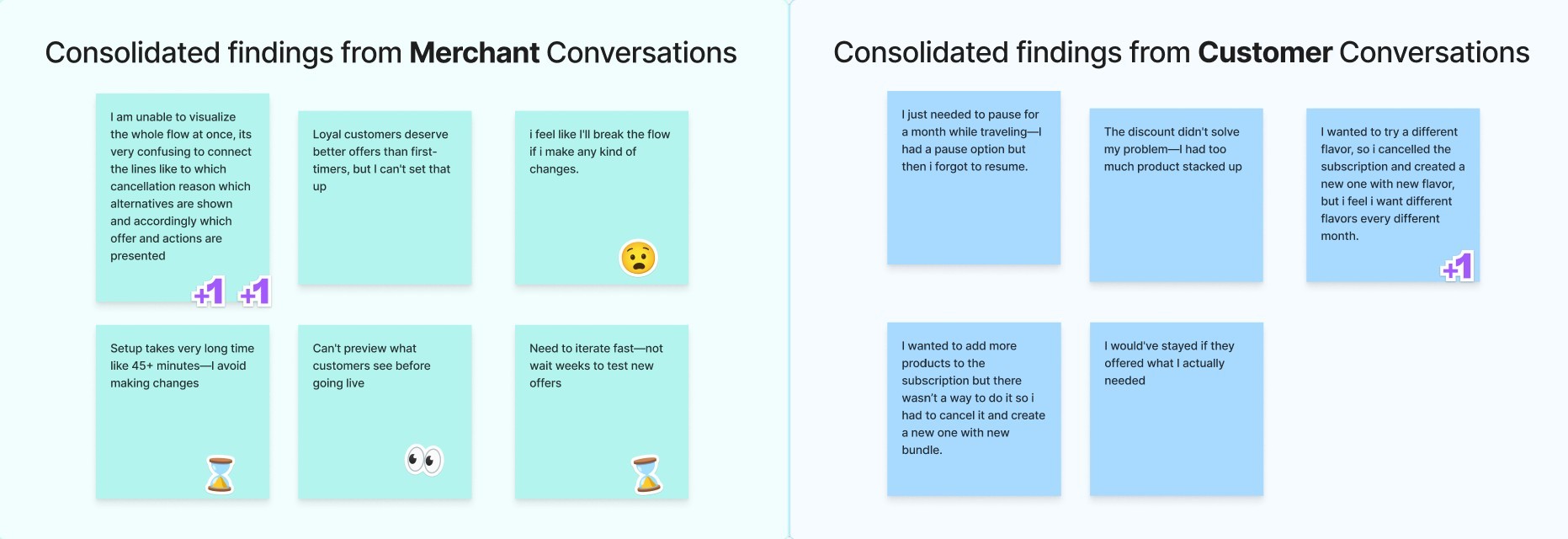
Consolidated Findings after User Interviews
What I explored
How merchants currently build cancel flows
What slows them down at launch
What customers want when they hit Cancel
Why personalization matters
What I found
They think in customer journeys, not nested lists
They need to see the whole flow at once, not piece-by-piece previews
Most don't want to leave—they want flexibility
Generic offers feel like spam; relevant ones feel like service
Flexibility was our biggest selling point but it was quietly slowing merchants down
And the team defended that promise, often.
Hard to argue with. But the more I sat with the design, the more I felt it had been over-applied in places - "flexible" had quietly become extra work for the merchant, with no real benefit for the subscriber. Research kept pointing the other way: merchants asking for less setup, not more.
So I started flagging examples. The conversations that followed pushed us to actually sit down and define what flexibility meant for this product.
The conversation
The cap on save offers
The custom button label
My concern
Merchants were stacking 5+ save offers per reason. Hick's Law - too many options, subscriber gives up and clicks cancel anyway.

Merchants picked an action and wrote a custom button label. The action name was already the right label - the extra field was setup work for marginal benefit.

Team's pushback
PM: "Merchants have the freedom to add as many as they want. It's their decision."
Engineering: "More customization is more flexibility."
Where we landed on flexibility
Flexibility means giving the merchant the choice, not removing it. A hard cap would contradict that, so it didn't ship. But a global setting where merchants choose the max number of save offers shown respects both sides — flexibility intact, just bounded. On my list for next cycle.
Flexibility means expanding what merchants can do, not multiplying the number of fields they have to touch. The custom-label field was an example; we cut it.
Competitive landscape
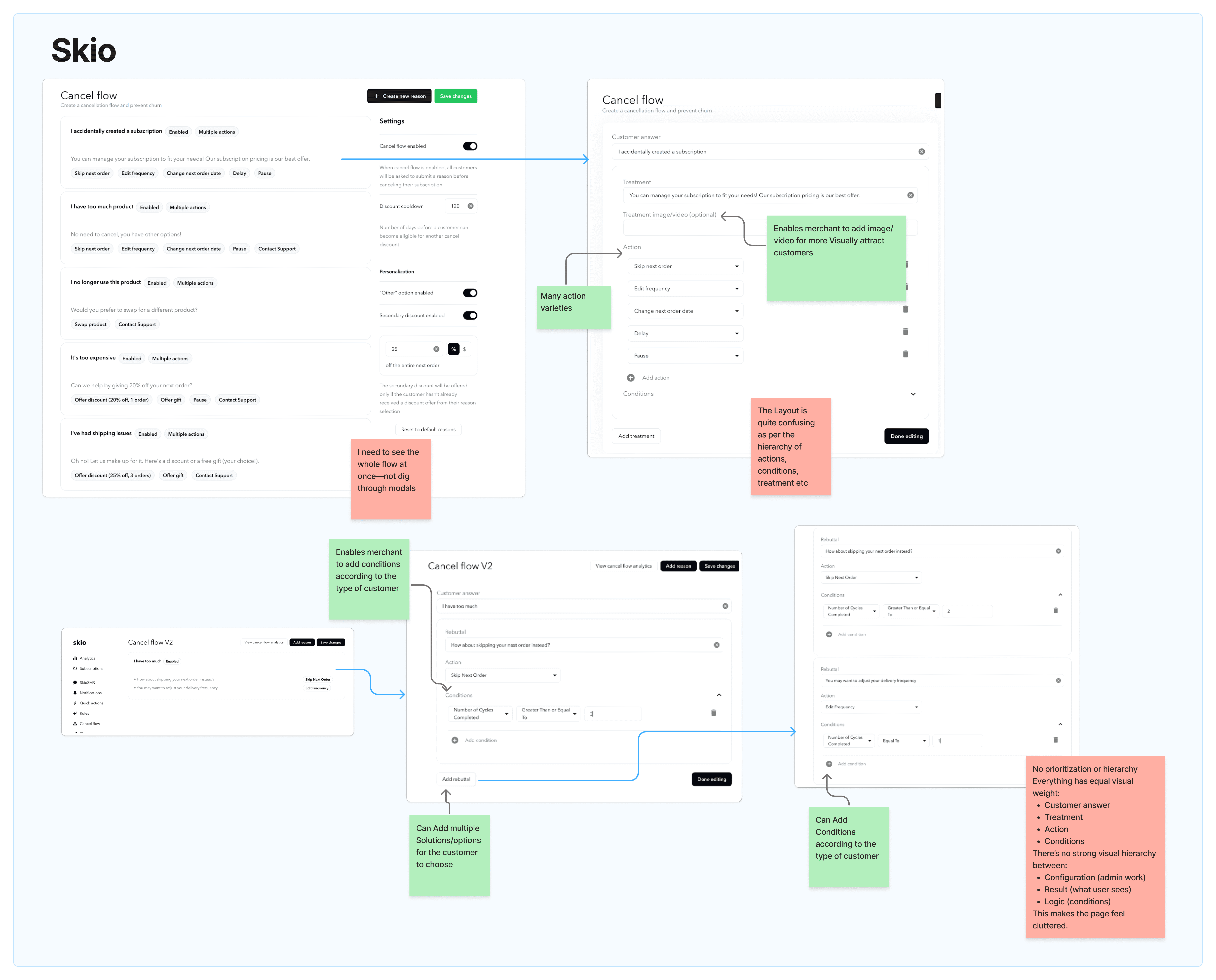
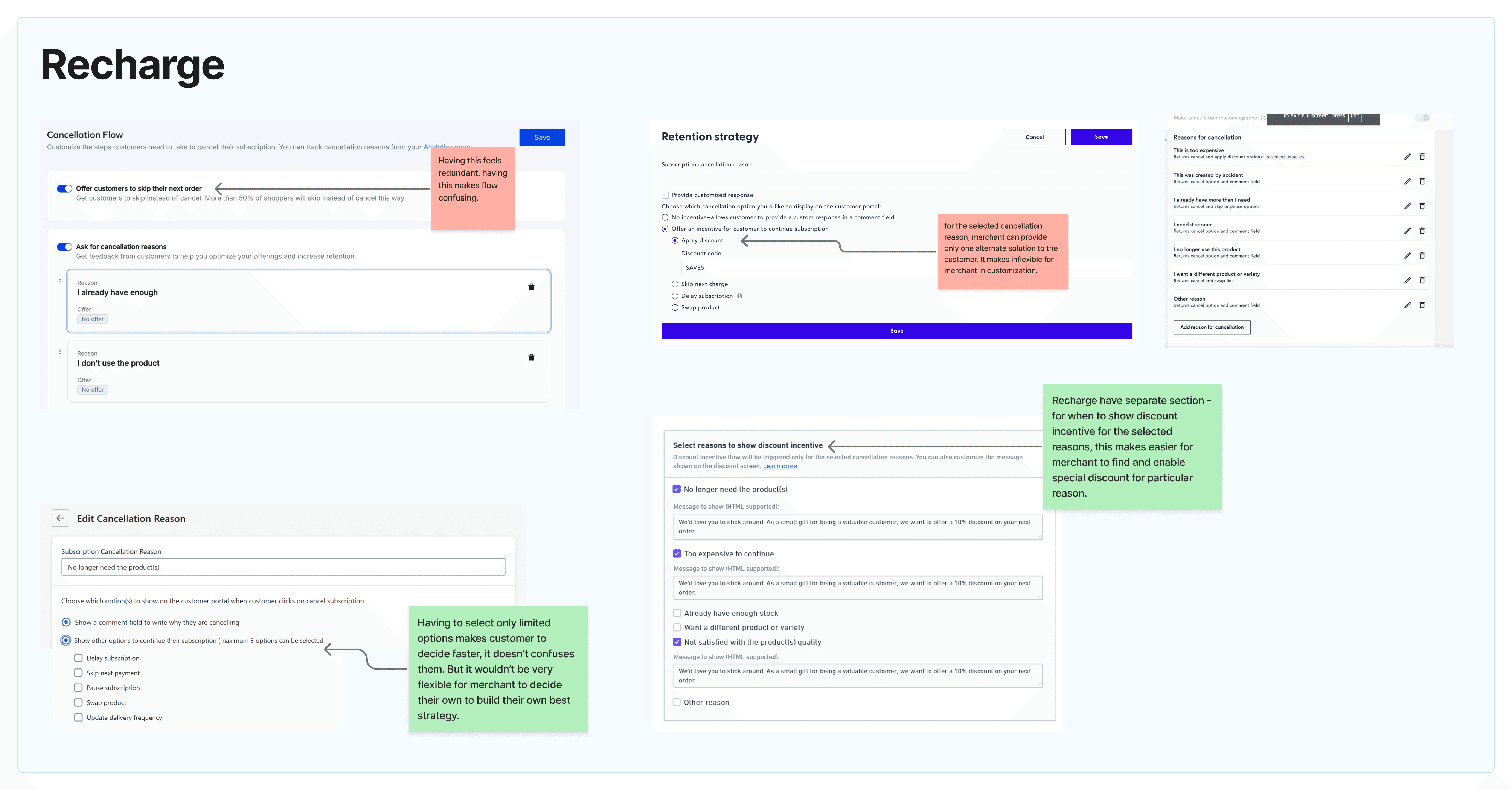
I benchmarked Skio and Recharge — the two market leaders YariFlow's clients had churned away from. Both had real strengths. Both failed merchants in opposite ways.
Where they worked
Conditional logic per treatment (Skio) — different solutions surfaced based on customer attributes
Action variety (Both) — pause, skip, discount, swap, edit-frequency, plus image/video uploads for the customer screen (Skio)
Reason-specific incentive section (Recharge) — a dedicated workflow for matching discount offers to cancel reasons.
Constrained subscriber view (Recharge) — 3-option cap kept the cancel screen fast and unconfusing for subscribers
Where they fell short
Flat visual hierarchy (Skio) — configuration, customer-facing preview, and condition logic all sat at equal visual weight, making the page feel cluttered
Configuration buried in modals (Skio) — merchants had to dig through nested views instead of seeing the whole flow at once
One alternate solution per reason (Recharge) — too rigid for merchants who needed different saves for different segments
3-option cap with no merchant override (Recharge) — fast for subscribers, but took strategy decisions out of merchants' hands
Skio gave power without visibility. Recharge gave clarity at the cost of control. The unmet need was both.
DESIGN EXPLORATION
Concept evolution
I sketched three directions on paper, then prototyped each in Figma Make, sketch to interactive flow in a day instead of a week, just enough to test the underlying logic before adding visual polish.
For every concept, I gathered feedback from three perspectives:
Merchants — the users
Engineering — feasibility
CXM — support implications
The lens I kept returning to was the merchant's mental model. Every retention manager I'd interviewed described their flow the same way — a journey on a whiteboard, branching by reason.

Which concept matches how they already think, instead of forcing them to think like the system?
❌ Wizard-based setup
One reason per screen, with live preview alongside.
Configuring a single reason — solution, condition, and customer-side preview, all on one screen.
Why it failed
Only one solution per reason, no segmented offers
Screen-by-screen pacing slowed merchants down
❌ Reusable solutions linked to reasons
Solutions created once (with optional conditions), then attached to reasons in a separate form. Multiple solutions per reason, reusable across many.
Creating a reusable solution with conditions, then linking it to multiple reasons in a separate form.
Where it landed
The win: reusable, consistent solutions
The miss: merchants couldn't see the flow as a journey - they had to assemble it mentally across two screens
✅ Visual flowchart builder
The whole journey on one canvas as flowchart.
Configuring a single reason on the canvas - multiple conditions and solutions, then the customer-side preview.
The trade-off
Engineering took on more, React Flow integration, drag-and-drop edge cases
YariFlow is desktop-first, so the canvas wouldn't translate cleanly to mobile if ever required
THE AFTER-MATH
Viable version validation
I ran usability tests on the final high-fidelity design with the four merchant teams from research, plus internal CXMs. All five participants completed the core task - building a segmented, multi-step cancel flow without help. Configuration time dropped from a 45–120 minute baseline to under 15 minutes on first try.

🎬 Usability testing: Merchant teams building a segmented cancel flow on the prototype, unaided - completed in under 15 minutes.
Note: YariFlow updated its design system just before this project. The old screenshots show the previous system; the redesign is built on the new one.
The Solution
Three user stories that map directly to the merchant gaps named above, each paired with the prototype walkthrough that solves it.
01
As a retention manager, I want to see my whole cancel flow on one canvas so I can spot gaps and iterate faster.
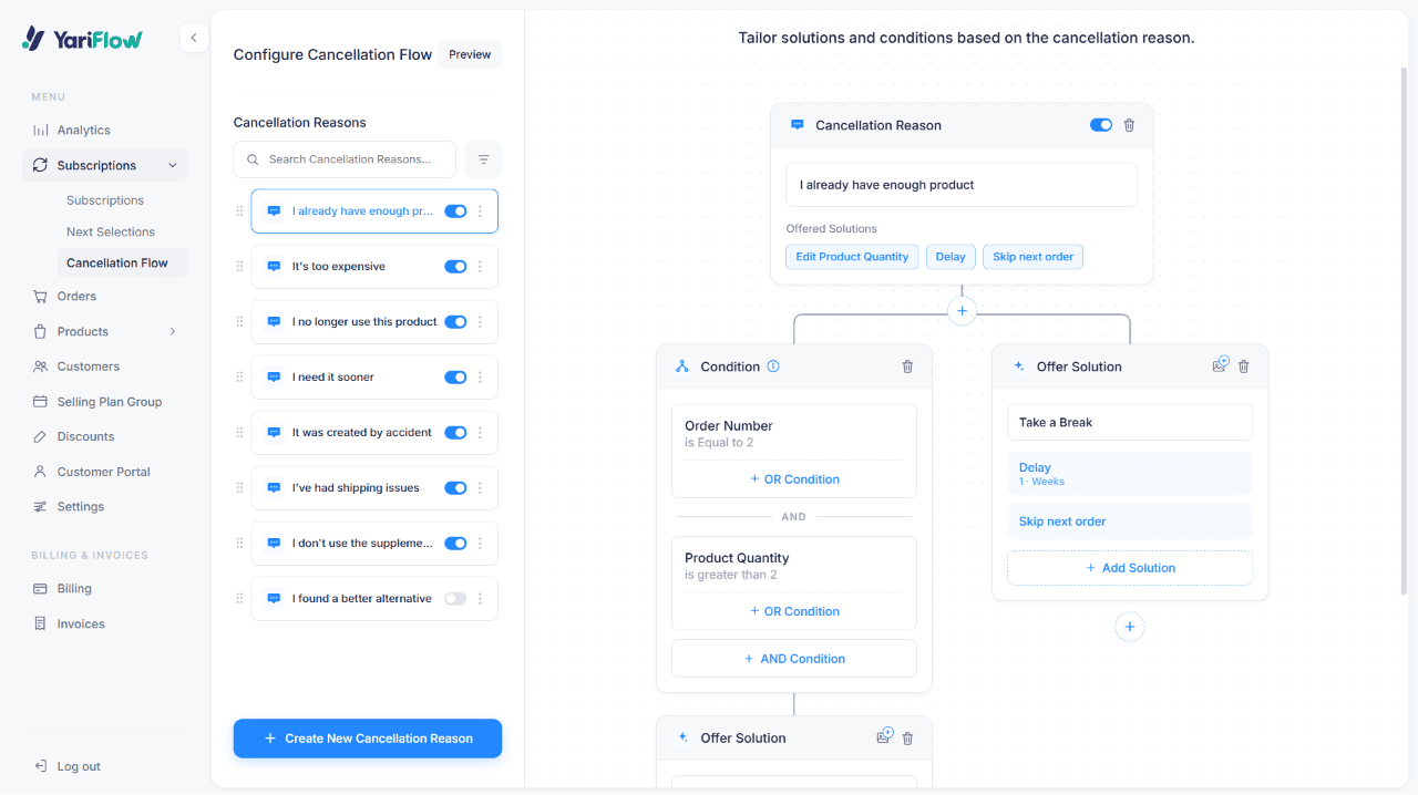
Full multi-reason cancel flow on the canvas.
02
As a retention manager, I want to set up customer-segment conditions myself, without filing a dev ticket, so my best subscribers don't get the same offer as one-time trialists.

Adding a condition with ANDs and ORs to control which specific subscribers see an offer — no engineer involved.
03
As a retention manager, I want to preview my flow as a specific subscriber, so I can verify my conditions work before they touch a real customer.
Testing the lo-fi prototype, I noticed conditions created a new problem: merchants built targeting logic but couldn't tell if it worked. So the preview simulates a subscriber — set attributes, see which offers surface.

Simulating a subscriber in preview - set their attributes, see which offers your conditions surface.
Building a multi-reason cancel flow on the canvas - full journey visible end-to-end.
THE IMPACT
Sweet ending
The redesign shipped to the brands whose interviews shaped it — Pact Coffee, Pasta Evangelists, Pinter, Free Soul, Raw Wine. And guess what? They loved it. It held up exactly where it mattered.

Full testimonials at yariflow.com
What I'd do next
Setup time was the first metric I could move in three weeks. The next one is the one that actually matters: save rates in production. If I had another cycle, I'd:
Save, undo, and duplicate
A save-flow button with undo history, plus the ability to copy a condition or save offer across reasons. Merchants told us they feared breaking their flows; safety nets and reuse would make iteration feel cheap instead of risky.
Build a template library
Most merchants start with the same 3–4 archetypes (loyalist, trialist, dormant). Pre-built starting points would push setup time below 5 minutes for the common case.
A/B test flows against each other
Let merchants run two versions of a cancel flow head-to-head and see which actually saves more subscribers, instead of guessing which offers work.
Add gaming prevention
Both Skio and Recharge let merchants set a discount cooldown to stop subscribers from repeatedly canceling to extract offers. YariFlow doesn't have this yet; it's the clearest gap my competitive research surfaced.
The deeper lesson for me: when a tool gets abandoned, it's almost never because users don't want the outcome. It's because the path to the outcome doesn't match how they think. The redesign didn't add capability, it removed the translation step between merchant intent and system structure.